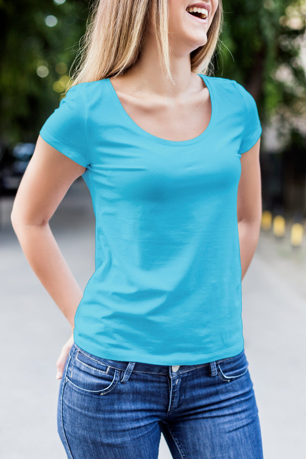
How to Make Customized Printed T-Shirts with Great Design
What makes a great T-shirt design? What is it about certain T-shirt designs that make people want to wear them time and time again? Your favorite T-shirt becomes a part of your identity. This is especially true for businesses who are using these T-shirts for free advertising. Now your designs are not only representing the person wearing the T-shirt, but also the business and the brand behind it.
Are you ready to make your design real? Get your shirt designs printed at AA Custom T-Shirt Printing today!
What Makes a Great T-Shirt Design?
Great design does not come from one single factor. There are so many elements and small details that go into it. When you are designing, you need to keep in mind the color and sizing choices as well as printing options, wearability, and staying within a budget. Moreover, your inspiration and passion for the design will go a long way. If you genuinely love your design, there is a good chance your audience will too.
Why Do You Want to Design a T-Shirt?
If you are reading this article, you probably already have a reason for wanting to design your own T-shirt. Whether you are looking to become the next great T-shirt designer or you just need a T-shirt made for your next office party, the basics will be the same.
No matter the reason for your T-shirt, you want to make sure it communicates clearly. If you are not sure where to start, it might be helpful to make a list of themes and styles you want your design to convey. Are you looking to do something playful or serious? Do you want a design that is edgy or conservative? A great T-shirt design will communicate all of these things at first glance.
Pre-Design Brainstorming
Spend some time brainstorming your concept before you even begin the actual design process. Sketch your design ideas. Try out several different variations. Put it away for a day or two and come back to it. Brainstorming before you start designing will save you time later!
Ask yourself these questions to help you hone in on your design needs. What is your brand? Is it a business brand or a personal brand? Who is your target market? Are you designing for an event, advertising purposes, or are you looking to sell your designs?
Are you designing for guys or girls? Kids or adults? Unless you are designing a T-shirt for yourself, you are going to want to take some time to think about your audience. It can be super helpful to visualize the person you are designing for and jot down some notes about who they are and what they like. That way, when you start working on your design on a digital design program like Photoshop, you can cater your work to your particular audience and need.
Remember Your Design Will Be on a T-Shirt
Make sure you get to see your design printed out in its actual size. Sometimes it can be hard to tell how it’s going to look online or when you print out a smaller version. You may even want to create a realistic mock-up of your T-shirt and print it out in actual size. This will give you the best idea of how it is going to look.
Considerations For Making a Great Design For Your Shirt
Sizing
Trying to figure out the sizing for your design can be tricky. You should think about the overall nature of the design when deciding on sizing. Additionally, think about the material and what kind of garment it is going to be printed on.
The shape of your design plays a significant role in how large or small it will look once printed. Shapes like circles and squares tend to look better if they are sized a little smaller than the standard.
It is a good idea to print out your design on paper and hold it up to the desired garment- or one of a similar size- to get an idea of how the sizing will look. You may also want to consider using a smaller size for designs that will go on smaller garments. One size does not fit all.
Placement
Make sure you center your designs visually. They should never be centered based on the width of the garment. One common mistake a lot of people make is focusing on the location of the design, when you really need to think about the measurements within that location. Another faux pah is the belly print. This placement is not flattering, and most people will not appreciate it. Some standard print locations that work well are either full front prints or full back prints.
Colors
Your color choices are super important in the design process. This is not only because you want a killer design, but it is also because screen printing can get super expensive the more colors you use.
If you are going to be getting your design printed direct to garment, you can use as many colors as you want without it affecting the cost. However, if you are going to get your T-shirt screen printed, the more colors you use, the bigger the dent it’ll put in your wallet.
You may not want to go overboard on the number of colors you use even if the cost is not an issue. The more colors you use, the more chances you have of clashing. Some people like single color graphics T-shirt that’s black or white. Others prefer lots of bright, vibrant colors. The key is to focus on the intended design to find the right color combination. Sometimes, it’s best to keep it simple.
For T-shirt designs, you have two sets of colors you have to keep in mind. You have the fabric colors, and then you have the print colors. Make sure you always set your background color to the color you plan to print on. Also, different colored fabrics can have an impact on how the ink is going to turn out when printed, so keep that in mind.
If your printer does custom colors, make sure you save the Pantone or CMYK color codes so that everything turns out looking the way you want it to.
Ink
T-shirts have several kinds of ink options to choose from, depending on your method of printing.
- Foil is reflective and shiny
- Gel is like high-density, with a wet look
- High-density gives your design dimension
- Plastisol is the standard screen-printing ink
- Water-based ink is ingrained in the fabric
Contrast
Contrast refers to the level of difference there is from the light parts of an image and the dark parts of an image. The most contrast is a black on white image or a white on black image. Bright colors on a dark background have quite a bit of contrast too.
The amount of contrast you are going to want all depends on the actual design you are working with and the look you are going for. Some designs may call for high contrast, while others look better with less contrast. Be careful with low contrast too though. It can be a fine line between low contrast and no contrast. For instance, you may want to avoid light gray ink on gray shirts or super light gray on white. Additionally, navy blue on black has almost no contrast as well.
Typography & Fonts
Typography is the way words look visually. Typography is different than the text itself; it is the combination of arranging type and choosing fonts in a way that will be visually appealing. This involves both letter and line spacing. The font you choose will have a huge impact on the overall aesthetic of the design.
The number one rule of typography – never use more than three different fonts in one design. Rule number two – unless you are creating a T-shirt for preschoolers, you probably want to avoid using a font such as Comic Sans. Just FYI.
Some great standard fonts work for a wide variety of purposes. Serif fonts tend to look more classic, while sans-serif fonts will give your design a more modern feel. There are so many fonts to choose from, so make sure you take advantage of that and explore your options. Sometimes you have to look through a LOT of different fonts to find the perfect one, so don’t settle on one of the first fonts you come across. Take your time and choose the one that speaks to your design goals.
Make sure you keep readability in mind when you choose your fonts. If the words are essential for the message you are trying to communicate, you are going to want to make sure people can read them.
Composition
Each design has individual elements that will be arranged in relation to one another. This relation makes up the overall composition of the design. Following some basic composition guidelines can improve your overall design aesthetic in a big way.
You want to make sure your elements are not too bunched together or too spaced out. You want to make sure your details are not off balance. You want to make the lines flow nicely together, while the type should fit comfortably within both the overall design and the garment itself.
You definitely want to make sure words are placed in a way in which they will be read in the correct order. A weird placement of the words can make your design say something completely different than what you intended.
Image Quality
Poor image quality is a huge problem. It is also one of the most common mistakes people make. If your image is too low of a resolution and does not have enough pixel information for a quality print, the end result is going to look super low budget. Usually, images from the internet are too small and low resolution. Quality images will be 20 dpi or higher when they are at their full size.
The solution is to use a vector file. Vector files are fantastic because they will scale to print precisely to any size and won’t lose their quality. So, with vector files resolution doesn’t matter. Vector files are typically made using Adobe Illustrator and are saved as either a PDF or an EPS file.
That’s All!
Now that you’ve got the basics, you are ready to start designing! Next step, you can visit us at AA Custom T-Shirt Printing, for all your custom T-shirt needs!